Daniel Njeru
June 13, 2023

How to set up MongoDB charts in Mingo

MongoDB charts are used to create a visual representation of MongoDB data. With MongoDB charts, you can communicate insights clearly and concisely. The feature will be useful when analyzing trends, presenting information, or making data-driven decisions. Complex information is conveyed in a more accessible format. That way, you can focus on developing actionable plans.

Mingo is a flexible and user-friendly tool for generating eye-catching charts in data analytics. Mingo is a powerful Graphical User Interface (GUI) tool with a wide range of features, among which it helps you set up professional charts. This article guides you in setting up MongoDB charts in Mingo, enabling you to create compelling visualizations for your data.

Charts you can set up on Mingo

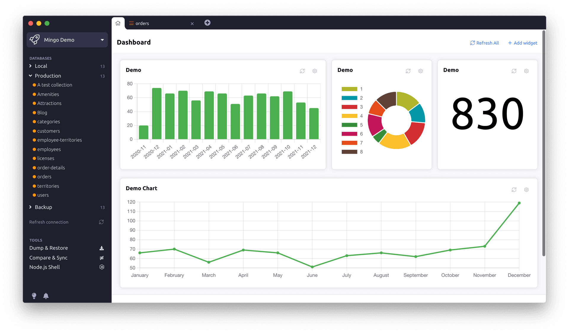
  1. Bar charts: A bar chart is also known as a bar graph. It displays information in rectangular bars. Bar graphs have a horizontal and vertical axis. You can use the horizontal axis to represent categories or groups being compared. These categories could be anything you want to analyze, such as products, days, or houses. The vertical axis, on the other hand, is representative of the values or magnitudes associated with each category. Thus, the height corresponds with the value or quantity being represented. In Mingo, you are required to include the title of your bar graphs. You can use these charts to visualize comparisons between categories, identify trends or patterns, and render information in a way that makes it easier to understand.
  2. Bar timeline charts: You can also visualize data using a bar timeline chart when using Mingo. The charts combine a bar chart's concepts but incorporate a timeline in the horizontal axis. This chart will come in handy when you need to illustrate the duration, progress, or scheduling of events over time. We recommend Mingo to project managers as it offers visual representations of the timeline, durations, and overlaps, making tracking a project’s progress easy.
  3. Line chart: Mingo also lets you visualize your data in a line chart. A line chart, also known as a line graph, displays a series of data points connected by a straight line. You can use the line chart to represent visual trends, changes, or relationships between variables over time or other continuous variables. In a line chart, the horizontal axis represents the independent variable, while the horizontal variable represents the dependent variable. Mingo allows you to visualize how the dependent variable changes with respect to the independent variable. Like any other chart, Mingo will prompt you to offer a title for the chart.
  4. Line timeline chart: This visualization tool combines the features of a line chart and a timeline. As such, it has data points along a chronological axis. In this type of chart, the horizontal axis represents the timeline on a chronological scale. This progression could be a range of hours, days, weeks, months, or years. The vertical axis, on the other hand, represents specific data at a particular time. These data points are represented using markers or dots and are connected using a line.
  5. Doughnut charts: A doughnut chart is circular with a hole at the center. It is a variation of a pie chart and displays data as proportional segments of a circle. The circle’s outer circumference is partitioned to represent different categories or data values. You can use these charts to compare the relative sizes of the categories relative to the entire portion. That way, data distribution can be highlighted, making it a great visualization tool.

Getting started with Mingo

Before we delve into chart creation, let us familiarize ourselves with Mingo’s features and have Mingo set up in your working environment. Here’s a step-by-step guide to get started:

  • The first step is downloading our desktop application which comes in the macOS version, windows, and Linux. Once you open the application, you will access the dashboard.
  • Data formats supported by Mingo include CSV/TSV, JSON or JavaScript Objects, and JSONL. Upload the file or connect to a cloud storage server to import your data into Mingo.
  • Data Preparation: Utilize Mingo's user-friendly data preparation tools to clean and modify your data. Make sure your data is properly structured and arranged for accurate chart development.

Creating charts in Mingo

Mingo charts are popularly referred to as widgets. Now that your data is ready, we will explore creating charts in Mingo. Follow the following steps to create charts in Mingo:

  1. Navigate to the dashboard and open the chart widget editor.
  2. Once the chart editor is open, select the title of your chart, database, collection and the chart type. Here, you can also tweak the color of your chart to your preference. Several alternatives are available in Mingo, such as bar charts, bar timeline charts, line charts, line timeline charts, and doughnut charts. To choose the best chart, consider your data type and the narrative you want to tell.
  3. Click the “Next step” button. This opens up the next page of the chart widget editor. Depending on the structure and use of your data, determine the X-axis and Y-axis values, data labels, and other crucial characteristics.

 Advanced charting techniques in Mingo

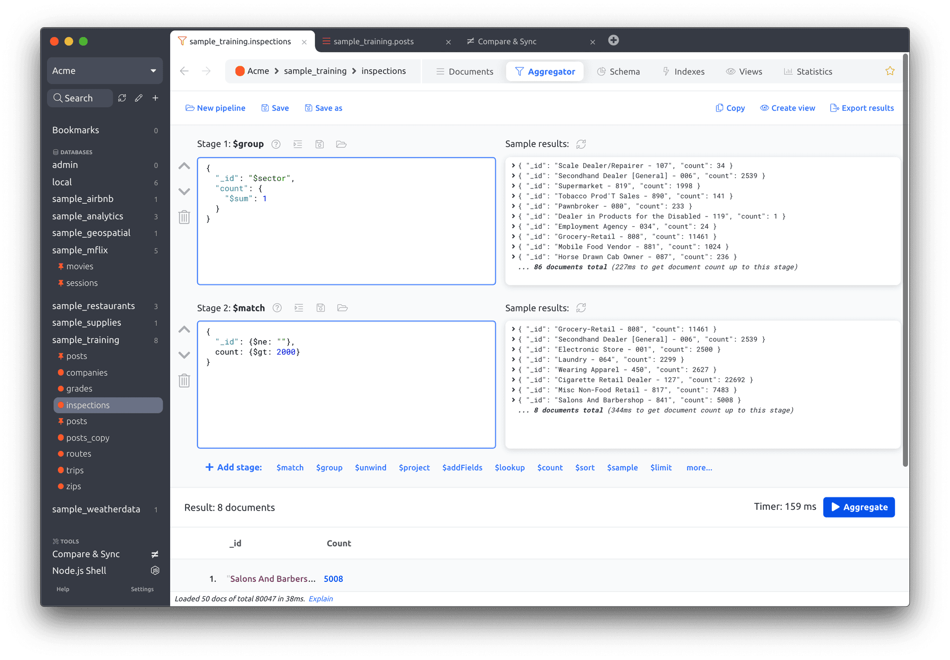
  • Data aggregation: With data aggregation in Mingo, you can summarize your data. By aggregating data points into categories, you can calculate sums, averages, or other statistical measures to create meaningful insights.
  • Trend analysis: Bar timeline charts and line timeline charts are useful when analyzing trends over time. They help you visualize changes and patterns in your data to uncover valuable insights and make informed decisions.

In the face of data analysis, Mingo offers an all-encompassing solution for setting up MongoDB charts that are informative and visually captivating. Following the outlined steps enables you to harness the power of Mingo’s charting capabilities. That way, you can transform raw data into visually compelling stories.

Create charts that resonate with your audience using Mingo’s features.

Read more

Mingo Development Update

We're currently in the middle of a big refactoring and code cleanup effort in Mingo. Our goal is to bring everything up to date, streamline the codebase, improve performance, and set the stage for faster development and new features in the future. Here's what's happening: All this work takes time, but we’re aiming to ship […]
Radoslav Toth

v1.14.1 Released

Mingo is back with a new release packed with 42 improvements, fixes and goodies.
Radoslav Toth

v1.13.5 released

We are regularly releasing new versions and did it again today. The latest release contains several UX improvements, fixes 4 reported bugfixes (thanks!) and 10+ unreported issues we found ourselves. Please keep reporting issues, we appreciate any feedback! Mingo should suggest the update automatically, or you can download it directly from our Download page.
Radoslav Toth

Using Mingo with FerretDB

Mingo is a suitable solution for a GUI for MongoDB and its open-source alternative, FerretDB. Since FerretDB is open source, developers can fully control and adapt it to suit specific needs. FerretDB with Mingo will offer you a visual representation of data and a user-friendly interaction, among other benefits. What is FerretDB FerretDB is the […]
Daniel Njeru

Taking Your Company to New Heights with MongoDB Charts in Mingo

Today we demystify how Mingo can ease your pain as a MongoDB user. Mingo has had positive reviews from all companies that have tried it out. Some users have loved it for its wide range of features that are not in other GUI tools, while others have remained loyal to us due to our favorable […]
Daniel Njeru

Demystifying Data Modeling in MongoDB: A Step-by-Step Approach

Data modeling is the process of defining how data is stored and the relationships that exist among different entities in your data. The organization of data inside a database is referred to as a schema. When developing your schema, put more thoughts on your application than your database. A good data model makes data management […]
Daniel Njeru

Indexing Strategies for High Performance in MongoDB

Indexes are unique data structures that store a small portion of the collection’s data in an ordered form that is easy to traverse and search efficiently. They point to the document identity and allow you to look up, access, and update data faster. In MongoDB, indexes are used to improve query performance. Indexes improve query […]
Daniel Njeru

Which companies are using MongoDB

Those who come bearing advice are rarely popular. Daedalus did not do his son Icarus any favors by warning him not to fly too close to the sun as his wax wings would melt, causing him to fall. Had Icarus not ignored his father’s advice, he would not have plummeted to his death. By all […]
Daniel Njeru

New version released: 1.13.1

Here's a short list of bug fixes and improvements in our latest release. It is definitely not complete, there are many minor goodies we didn't even mention here. Enjoy! Bug Fixes Enhancements We would like to thank all the contributors for their valuable feedback and bug reports. Your contributions help us make Mingo better. Please […]
Radoslav Toth

MongoDB Atlas vs. self-hosted MongoDB quick guide.

It is plain as day that MongoDB has been a popular database solution for many applications in the recent past. One may argue this is due to its flexibility, scalability, and ease to use. However, Organizations are faced with opting for MongoDB Atlas, a fully managed cloud-based database service, or having MongoDB set up and […]
daviddurika
1 2 3

Download Mingo now

The best MongoDB GUI Admin. Intuitive • Fast • Secure
Download Now